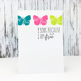
The gallery is sure to be full of pretty, fluttering things, but with Valentine's Day a week away maybe you'll find your hearts a-flutter with something different than the literal meaning!
As always, remember the following CAS guidelines when creating your design:
- One main image
- Lots of open space, uncluttered
- Limited layers & embellishments
- Quick & easy to recreate (Note: It may take a while to create a design you like, but once you have that design, making more should be a piece of cake!)
Guest Designer: Barb G.
design defined:
A monochromatic color palette goes a long way for a CAS design.
design defined:
A monochromatic color palette goes a long way for a CAS design.
design defined:
The rule of "one third" is a great reminder in CAS creation.
The rule of "one third" is a great reminder in CAS creation.
design defined:
In laying a die cut in a quote adds interest to simple card.
design defined:
Black is always a great contrast when using multiple colors on a card.
design defined:
White die cuts help preserve white space.
design defined:
A monochromatic colour scheme is an easy way to keep things CAS.
design defined:
A single image with a sentiment makes for a classic CAS design.
design defined:
The rule of 3 works great with CAS designs.
The rule of 3 works great with CAS designs.
Stamp a large image off the edge to preserve white space.
design defined:
A busy paper can be CAS if used in a small section on your card.
Go have fun creating your CAS design and don't forget to link up here on the challenge blog by Monday at 9 A.M. (CST)!


No comments:
Post a Comment