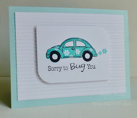
It's time for a new cue and after last week's rather abstract thinking, we thought we go with a more familiar theme. Plenty of room for interpretation with this one too and we can't wait to see where your thoughts take you!
As always, remember the following CAS guidelines when creating your design:
- One main image
- Lots of open space, uncluttered
- Limited layers & embellishments
- Quick & easy to recreate (Note: It may take a while to create a design you like, but once you have that design, making more should be a piece of cake!)
design defined:
design defined:
Shaped panels & embossing folders add interest to CAS designs.
Shaped panels & embossing folders add interest to CAS designs.
A splash of watercolour adds interest to a die cut.
Jen
design defined:
Washi tape is a great way to add some fun without too much busyness to a CAS design.
design defined:
Washi tape is a great way to add some fun without too much busyness to a CAS design.
Classic CAS design has the focal point centered in the top 1/3 of the card.


birthday cousin
ReplyDelete