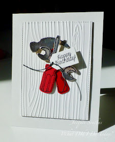
It's time to add a little shine to your week! Either that or creative inspiration will foil your plans to go with the obvious.
As always, remember the following CAS guidelines when creating your design:
- One main image
- Lots of open space, uncluttered
- Limited layers & embellishments
- Quick & easy to recreate (Note: It may take a while to create a design you like, but once you have that design, making more should be a piece of cake!)
STAMPlorations is returning as our wonderful sponsor and is offering this week's winner a $15 gift certificate to the online store! Remember, during the weeks STAMPlorations is sponsoring us, you can refresh your craft stash with the help of the 10% off discount code, CASOLOGY!
Let's see what the design team created for inspiration!
design defined:
Balance a large image with a smaller sentiment to preserve white space.
Balance a large image with a smaller sentiment to preserve white space.
design defined:
A shaped border can add easy interest to a CAS design.
A shaped border can add easy interest to a CAS design.
design defined:
Cluster embellishments to preserve white space.
design defined:
Offset your image to create interest.
design defined:
A large sentiment makes a bold statement in a CAS design.
design defined:
Stack your die cuts for added dimension.
Stack your die cuts for added dimension.
design defined:
A bold focal point on a soft background works great for CAS design.
A bold focal point on a soft background works great for CAS design.


Gorgeous foil cards! xxx
ReplyDelete