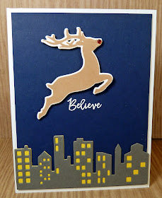
It's time for a new cue word and we believe you'll like this one!
As always, remember the following CAS guidelines when creating your design:
- One main image
- Lots of open space, uncluttered
- Limited layers & embellishments
- Quick & easy to recreate (Note: It may take a while to create a design you like, but once you have that design, making more should be a piece of cake!)
Guest Designer: Valliam
design defined:
Using a sentiment as the focal point makes a great CAS design!
Clustering to preserve white space.
Bharati
design defined:
Just a bit of stenciling and a bold sentiment adds interest to a simple CAS design.
design defined:
Just a bit of stenciling and a bold sentiment adds interest to a simple CAS design.
design defined:
Adding light details to the background of a card can still keep it CAS.
Adding light details to the background of a card can still keep it CAS.
design defined:
Let your sentiment take centerstage for a CAS design.
Let your sentiment take centerstage for a CAS design.
One image, and anchor point and a sentiment is all you need for a CAS card.
Go have fun creating your clean & simple design and don't forget to link up here on the challenge blog by Monday at 9:00 a.m. (CDT)!


Wow, stunning DT cards! Jo x
ReplyDelete