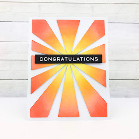
It's time for a new cue word! Who needs a little extra sunshine this week?
As always, remember the following CAS guidelines when creating your design:
- One main image
- Lots of open space, uncluttered
- Limited layers & embellishments
- Quick & easy to recreate (Note: It may take a while to create a design you like, but once you have that design, making more should be a piece of cake!)
Let's see what the design team and this week's guest designer created for inspiration!
Simple images colored in neutrals can make colored embellishments take center stage.
design defined:
design defined:
Limit the supplies and colors for CAS look.
Limit the supplies and colors for CAS look.
Deidre
design defined:
Keep the main elements of your design together, allowing for adequate white space.
design defined:
Keep the main elements of your design together, allowing for adequate white space.
design defined:
White space doesn't have to be white.
White space doesn't have to be white.
Black + white + 1 colour really makes a CAS card pop!
Cluster your sentiment and die cuts over a blended background.
Go have fun creating your CAS design and don't forget to link up here on the CASology blog by Monday, August 13, at 9:00 a.m. (CDT)! Remember this is a two-week challenge again!


No comments:
Post a Comment