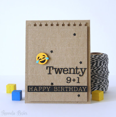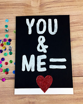
Ready for a little number crunching? Even if you're not especially good at math, we're pretty sure your creativity will take over and you'll do just fine with this week's cue!
As always, remember the following CAS guidelines when creating your design:
- One main image
- Lots of open space, uncluttered
- Limited layers & embellishments
- Quick & easy to recreate (Note: It may take a while to create a design you like, but once you have that design, making more should be a piece of cake!)
Guest Designer: Hannelie B.
design defined:
Scoring adds interest and can be helpful to get that sentiment 100% aligned.
design defined:
Scoring adds interest and can be helpful to get that sentiment 100% aligned.
design defined:
White space can be black.
design defined:
Stenciling with texture paste adds dimension and interest without bulk.
design defined:
Overlap images to preserve white space.
design defined:
Ribbon and a sentiment is all you need sometimes.
design defined:
A busy background stamped in a very light colour can add texture to a CAS design without overwhelming it.
A busy background stamped in a very light colour can add texture to a CAS design without overwhelming it.
design defined:
Use tone on tone die cuts to create texture.
Use tone on tone die cuts to create texture.
Go have fun creating your CAS design and don't forget to link up here on the CASology blog by Monday, November 5, at 9:00 a.m. (CST)!


nyc
ReplyDeletenyc
ReplyDelete