Seiten

Tuesday, April 9, 2019

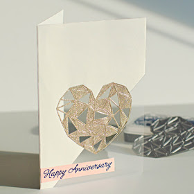
Week 338: PLASTIC


Paper or plastic?  We're going with plastic this week.  What will you think of with this one?

As always, remember the following CAS guidelines when creating your design:
  1. One main image
  2. Lots of open space, uncluttered
  3. Limited layers & embellishments
  4. Quick & easy to recreate (Note: It may take a while to create a design you like, but once you have that design, making more should be a piece of cake!)
Let's take a look at what the design team and this week's guest designer created for inspiration!


Guest Designer:  Francesca
design defined:
Keep elements to one third of your design.


Bharati
design defined:
Keeping the colors minimum helps the CAS look.


Deidre
design defined:
Don't be afraid to mix up materials in a CAS design!


design defined:
Add dimension in unique ways to create interest.


design defined:
Layer your elements to preserve white space.


Jen
design defined:
Use a shadow to ground a solitary image.


Joyce
design defined:
Use color to reinforce your message.


Karen
design defined:
Limit your design to just a portion of your card.


design defined:
Black and white is always a clean and simple color scheme!


Sue
design defined:
Leaving a lot of open space is a key to CAS design.


Go have fun creating your CAS design and don't forget to link up here on the CASology blog by Monday, April 15, at 9:00 a.m. (CDT)!

You are invited to the Inlinkz link party!
Click here to enter

No comments:

Post a Comment