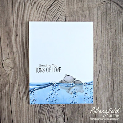
Like to travel? We're going on a trip in the gallery this week and we hope you'll come along!
As always, remember the following CAS guidelines when creating your design:
- One main image
- Lots of open space, uncluttered
- Limited layers & embellishments
- Quick & easy to recreate (Note: It may take a while to create a design you like, but once you have that design, making more should be a piece of cake!)
Bharati
design defined:
Not coloring the images helps keep it CAS.
design defined:
Not coloring the images helps keep it CAS.
design defined:
Work along the edges to leave plenty of white space.
design defined:
White on white layers helps keep the design CAS.
White on white layers helps keep the design CAS.
design defined:
Contain your scene in a rectangle or frame.
design defined:
White space doesn't have to be white.
White space doesn't have to be white.
Use your sentiment to ground your images.
Go have fun creating your CAS design and don't forget to link up here on the CASology blog by Monday, April 29, at 9:00 a.m. (CDT)!


That's such a lovely theme. Beautiful cards by all
ReplyDeleteOh, what a fun theme. Beautiful inspiration from the team. Hugz
ReplyDelete