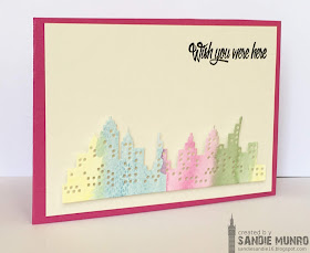
March has arrived and spring is beginning to appear on the horizon! Let's focus on the skyline this week!
As always, remember the following CAS guidelines when creating your design:
- One main image
- Lots of open space, uncluttered
- Limited layers & embellishments
- Quick & easy to recreate (Note: It may take a while to create a design you like, but once you have that design, making more should be a piece of cake!)
Let's see what the design team and our guest designer created for inspiration to get us started!
design defined:
Light ink colors can keep a large image CAS.
Keep everything in 1/3 of the card.
design defined:
Picking out one colour from a die keeps lots of white space, but still with some pops of colour.
Go have fun creating your CAS design and don't forget to link up here on the CASology blog by Monday, March 16, at 9:00 a.m. (CDT)!


Some fabulous cards - love that they are all so different!
ReplyDelete