Seasons are changing again and it feels like fall's arrival always brings on a happy feeling! As summer fades into rich, autumn colors, let's share all the happiness we can in the gallery this month!
As always, remember the following CAS guidelines when creating your design:
- One main image
- Lots of open space, uncluttered
- Limited layers & embellishments
- Quick & easy to recreate (Note: It may take a while to create a design you like, but once you have that design, making more should be a piece of cake!)
Let's take a look at what the design team and our guest designer created for inspiration!
Keeping the image and sentiment in one little corner makes for lots of clean, white space!
design defined:
One main image and LOTS of white space keeps your card clean.
Layering white elements helps preserve white space.
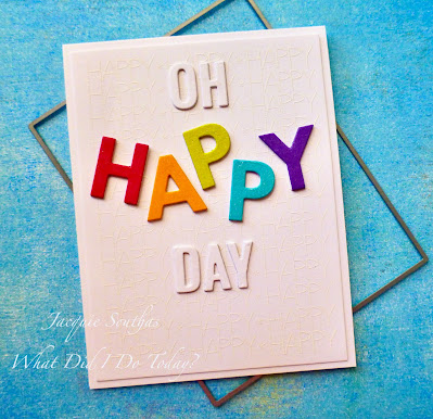
Lots of colours can be overwhelming in a CAS card, but not if you only use them in little bits.
design defined:
You can use large dies and layers in CAS cards, but keep the colours simple.
Go have fun creating your very own CAS design and don't forget to link up here on the CASology blog by Monday, October 3, at 9:00 a.m. (CDT)!


No comments:
Post a Comment