Two more weeks have passed and it's time for another cue word! Summer tends to be busy with sports of all kinds and people find themselves sporting their summer styles and hair dos. The gallery will definitely be a fun one!
As always, remember the following CAS guidelines when creating your design:
- One main image
- Lots of open space, uncluttered
- Limited layers & embellishments
- Quick & easy to recreate (Note: It may take a while to create a design you like, but once you have that design, making more should be a piece of cake!)
STAMPlorations is returning as our wonderful sponsor and is offering this challenge's winner a $15 gift certificate to the online store! Remember, during the weeks STAMPlorations is sponsoring us, you can refresh your craft stash with the help of the 10% off discount code, CASOLOGY!
Be sure and check out their sale on select products going on right now!
Let's see what the design team created for inspiration!
Use an embossing folder for some texture to give your CAS design some interest.
design defined:
Colored sentiments add interest to a CAS design.
Colored sentiments add interest to a CAS design.
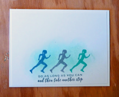
Keep your elements to one third to preserve white space (and I have 2 other cards on my blog).
design defined:
Black, white and one colour work well for a CAS design.
Black, white and one colour work well for a CAS design.
Karen
design defined:
Let your image take the spotlight by positioning it center stage.
design defined:
Let your image take the spotlight by positioning it center stage.
design defined:
Personalize elements of a CAS card, like the 'A' on the ball cap for a fun touch.
design defined:
Use embellishments sparingly on a CAS design.
Outline images create the illusion of white space.
Go have fun creating your CAS design and don't forget to link up here on the CASology blog by Monday, August 27, at 9:00 a.m. (CDT)! Remember this is a two-week challenge again!
Go have fun....


No comments:
Post a Comment