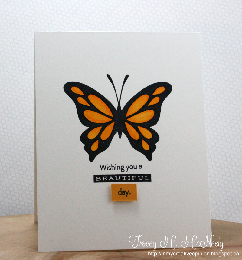
Do clean & simple designs make your heart flutter? Then, you're at the right place this week! We're going to see where this cue word takes your CAS creativity!
This week, we have one of our wonderful sponsors returning!
Add a Little Dazzle is back and offering this week's winner a $25 gift certificate to their online boutique! Still haven't tried their metal sheets? You really should!
Let's take a look at what this week's guest designer and the design team have created for inspiration!
Guest Designer: Karren
design defined:
Cutting off parts of an image can add interest to a CAS card.
Judy
design defined:
Cutting off parts of an image can add interest to a CAS card.
Judy
design defined:
You can make your main focal point more complicated if you leave lots of white space on the rest of the card.
Melissa
You can make your main focal point more complicated if you leave lots of white space on the rest of the card.
Melissa
design defined:
Keep your design in the top 1/3 of the card.
Now go have fun creating your CAS design and don't forget to link up here on the challenge blog by Monday at NOON (CDT)!
Keep your design in the top 1/3 of the card.
Now go have fun creating your CAS design and don't forget to link up here on the challenge blog by Monday at NOON (CDT)!


Such awesome cards, ladies!!! Love them! And what a fun cue card!
ReplyDeleteAnother great cue card, and fun inspirations from the DT's, just added my card with a different interpretation :)
ReplyDeleteSo many great projects! I wasn't able to finish mine by the deadline, but I was so inspired I made it anyway lol.
ReplyDeletehttp://ohhhsnapper.blogspot.com/2014/09/flutterby.html