This week's word is sure to have you thinking quite literally. We know the calendar isn't saying there is a patriotic holiday anytime soon, but that won't keep us from using flags on our creations this week! Of course, there may be some of you who find this word inspires you to make something completely lacking a flag! Interpret this word however you want to!
Let's see what the design team and this week's guest designer created for inspiration!
Guest Designer: Anita
design defined:
Adding simple embossing to the background adds interest without losing that all important white space.
design defined:
Adding simple embossing to the background adds interest without losing that all important white space.
Ardyth
design defined:
Let your sentiment take centre stage for an easy CAS card!
Gillian
design defined:
Keep your design to one corner of your card to preserve lots of white space.
Jen
design defined:
Let your sentiment take centre stage for an easy CAS card!
Gillian
design defined:
Keep your design to one corner of your card to preserve lots of white space.
Jen
design defined:
Minimal color will keep your card CAS.
Minimal color will keep your card CAS.
design defined:
Let your one main image take center stage on a CAS card!
Let your one main image take center stage on a CAS card!
design defined:
Basics of CAS: Single layer, "rule of three," lots of white or free open space, and minimal embellishments!
May
Basics of CAS: Single layer, "rule of three," lots of white or free open space, and minimal embellishments!
May
design defined:
Patterned paper works on a clean and simple card in small doses.
Patterned paper works on a clean and simple card in small doses.
design defined:
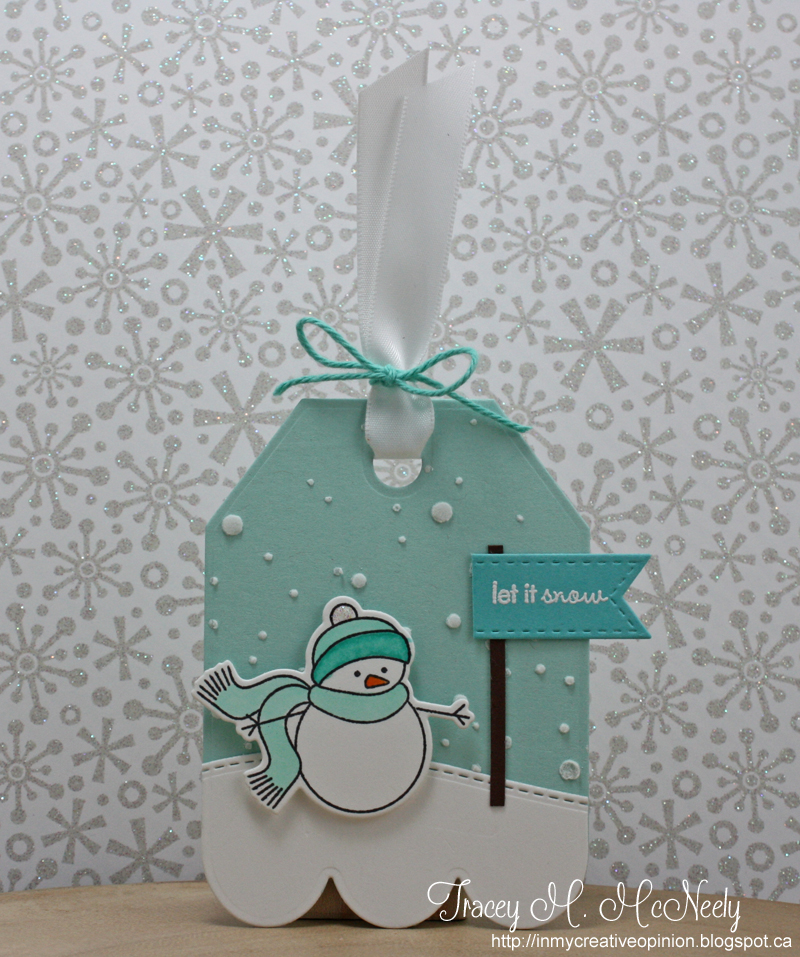
You can frame your main image with a simple, popped up shape & still preserve white space.
Tracey

design defined:
Embossing paste adds subtle texture and interest to you design without adding a lot of distraction.

design defined:
Embossing paste adds subtle texture and interest to you design without adding a lot of distraction.
Now go have fun creating your CAS design and don't forget to link up here on the challenge blog by Monday at NOON (CST)!


Terrific inspiration from the DT!!
ReplyDeleteBeautiful projects ladies :-D
ReplyDeleteSuper and stunning inspiration all round ladies.
ReplyDeleteEach one unique and terrific
Sarah xx
Such AWESOME cards, ladies!!!
ReplyDelete