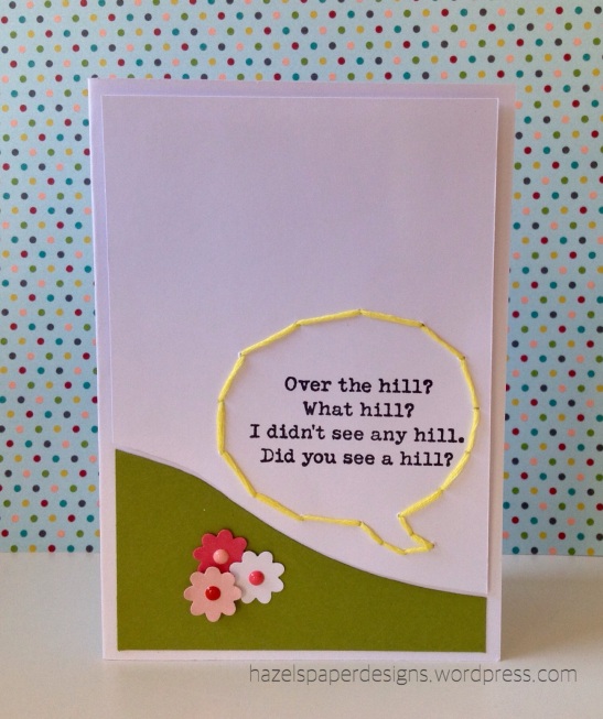
It's time for a new cue word and we're stepping back in time! We're curious to see what this word makes you think of!
Waffle Flower is joining us as our sponsor this week!
Waffle Flower Crafts started in April 2014 to explore possibilities in product designs. We like to think of ourselves as a tool company. We hope our stamps, dies and inks will help make crafting fun and approachable for everyone!
Fun, Inspiring, Versatile and Easy to use; all of our
products were designed with our FIVE code in mind. We’re dedicated to bringing
you the best crafting experience by using high quality photopolymer for our
stamps, safe metal for our dies; all made in USA.
We are now proud to have over 70 products in our product
line with many more coming every quarter.
We hope you can find time to create and make something
today!
Follow us for your daily dose of inspiration:
·
Blog: http://waffleflower.com/blog
·
Instagram:
http://instagram.com/waffleflowercrafts/
·
Facebook:
https://www.facebook.com/waffleflowercrafts/
·
Pinterest: http://www.pinterest.com/waffleflower/
·
Youtube: https://www.youtube.com/waffleflowercrafts/
Join the fun by
·
Using #WaffleFlowerCrafts on
social media sites.
·
Linking to our Flickr group: http://www.flickr.com/groups/2540006@N24/
·
Playing in our bi-weekly
challenge: http://bit.ly/WFChallenge
This week's winner will win one stamp set or their choice from the online store!
Let's take a look at what the design team and this week's guest designer created for inspiration!
Guest Designer: Kelly
design defined:
Use the rule of thirds. Position your focal point a third of the way up or down your card to create interest but still preserve your white space.
design defined:
Use the rule of thirds. Position your focal point a third of the way up or down your card to create interest but still preserve your white space.
design defined:
Pop up a shape from your focal panel for interest without lots of extra 'stuff'!
Gillian
Pop up a shape from your focal panel for interest without lots of extra 'stuff'!
Gillian
design defined:
Black and white with a small pop of color can be very CAS.
Masking and layering images provides depth without bulk.
Kimberly
Black and white with a small pop of color can be very CAS.
Masking and layering images provides depth without bulk.
Kimberly
design defined:
One layer, Lots of open space keeps it CAS!
One layer, Lots of open space keeps it CAS!
Sponging the edges of your card adds depth and character.
Melissa
design defined:
Add dimension to abundant white space by popping up the main panel of your design.
Go have fun creating your CAS design and don't forget to link up here on the challenge blog by Monday at NOON (CDT)!


Great DT cards, Jo x
ReplyDeleteOh, what a fun challenge and beautiful DT cards! I hope I'll have time to participate! ^_^
ReplyDeleteTotally forgot to link my card up yesterday.
ReplyDeleteI love the wide design range this word offers in your terrific inspiration cards!! Thank you, as always!! Hugs, Darnell
ReplyDelete