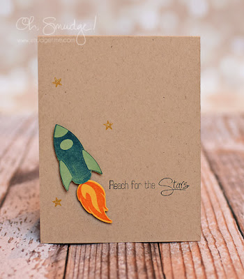
CAS design is an art not a science, but we're going to get scientific and see how this cue word affects your brain cells! Are you ready to experiment with CAS design again this week? Crafty messes are allowed.
Melon Door Lighthouse is returning as our sponsor this week and our winner will receive a free digital stamp set of their choice from the online store!
Let's take a look at what the design team and this week's guest designer created for inspiration!
When using soft colours, choose a grey sentiment for less harsh contrast.
White space doesn't have to be white.
Add a little interest to your CAS design by popping up a die cut image.
Go have fun creating your CAS design and don't forget to link up here on the challenge blog by Monday at NOON (CDT)!


OMG what awesome inspiration!! Just lord your card Hannielle!
ReplyDeleteSorry for the typo…Meant ..Just loved your card Hannielle!
ReplyDeletegreat word and fab cards!
ReplyDelete