They say laughter is the best medicine, so we thought we'd have a dose (or more) this week! Get ready to smile! This should be a fun week!
Serendipity Stamps is returning this week as our wonderful sponsor & this week's winner will receive a $20 gift certificate to the online store!
Let's take a look at what the design team and this week's guest designer created for inspiration!
Inlaying die cuts adds definition and interest without layers.
design defined:
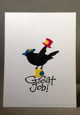
Use your sentiment to 'ground' your image.
Use your sentiment to 'ground' your image.
A pop of colour on a black and white design makes for a great CAS card.
White on white texture and layers add interest to a CAS card.
design defined:
With lots of white space, you can have bursts of color if kept in a concentrated area.
Kymona
design defined:
One image and a sentiment makes a CAS card!
Kymona
design defined:
One image and a sentiment makes a CAS card!
Melissa
design defined:
Using a sentiment as a focal point can help keep things simple on a CAS design.
Go have fun creating your CAS design and don't forget to link up here on the challenge blog by Monday at NOON (CDT)!


so funny inspirations! great challenge!
ReplyDeletethis is going to be so much fun hahahahaha
ReplyDeleteSo happy to be playing again, love your current challenge and thanks so much for the opportunity to enter.
ReplyDeleteI couldn't pass THIS up!! I had a much-needed belly laugh from your incredible inspirations for this one, so thank you for that!! Hugs, Darnell
ReplyDeleteThanks so much for the fun inspiration! It really got me thinking...
ReplyDeleteThanks for the guest spot this week! Fab inspiration from the DT as usual!
ReplyDelete