It's time to welcome a new cue word to the craft table! There are so many life events that this one could apply to! What does it bring to mind for you?
As always, remember the following CAS guidelines when creating your design:
- One main image
- Lots of open space, uncluttered
- Limited layers & embellishments
- Quick & easy to recreate (Note: It may take a while to create a design you like, but once you have that design, making more should be a piece of cake!)
Cindy B Designs is returning as our sponsor and offering this week's winner a $25 PayPal gift certificate!
Let's take a look at what the design team and this week's guest designer created for inspiration!
Use a little scene as the main image with lots of white space.
Ardyth
design defined:
Let your sentiment be your focal point!
Deidre
Ardyth
design defined:
Let your sentiment be your focal point!
Deidre
design defined:
Don't be afraid to layer your sentiment over your image in a CAS design.
Hannelie
design defined:
dimensional negative space adds interest to a CAS design.
Hazel
design defined:
dimensional negative space adds interest to a CAS design.
Hazel
design defined:
A simple monochrome design can be CAS.
Creating a visual triangle helps keep your CAS design balanced.
Keeping your card design to 1/3 of the card is classic CAS.
A dimensional sticker can be a fun touch on a CAS card!
Kymona
design defined:
Using big images does allow you to create a CAS card!
Melissa
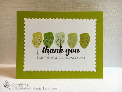
Lots of white space is very helpful in CAS design.
Sherrie
design defined:
design defined:
Using big images does allow you to create a CAS card!
Melissa
Lots of white space is very helpful in CAS design.
Sherrie
design defined:
Keep it CAS with a monochromatic color scheme.
design defined:
One colour and white embossing keeps your design more CAS.
One colour and white embossing keeps your design more CAS.
Go have fun creating your CAS design and don't forget to link up here on the challenge blog by Monday at NOON (CST)!


No comments:
Post a Comment