Sometimes life is just plain sweet and we think you'll agree that life here on the CASology blog is exactly that this week! It will be interesting to see what icing makes each of you think of!
As always, remember the following CAS guidelines when creating your design:
- One main image
- Lots of open space, uncluttered
- Limited layers & embellishments
- Quick & easy to recreate (Note: It may take a while to create a design you like, but once you have that design, making more should be a piece of cake!)
Serendipity Stamps is returning as this week's sponsor and is offering this week's winner a $20 gift certificate to use in their online store!
Guess what?! Today just happens to be Kymona's birthday, so be sure you stop by her blog and wish her a very Happy Birthday! She's offering up a little blog candy too, so by taking the time to leave her a little blog love, you'll have a chance to win!
Let's take a look at what the design team and guest designer created to inspire for this week's cue!
design defined:
Adding texture (glitter & glossy accents) helps reinforce the theme on CAS designs.
Deidre
design defined:
Adding texture (glitter & glossy accents) helps reinforce the theme on CAS designs.
Deidre
design defined:
A dimensional focal image can still be A CAS design!
design defined:
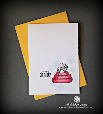
Subtle stenciling behind your focal image can add interest to a CAS design.
Subtle stenciling behind your focal image can add interest to a CAS design.
design defined:
Patterned paper in small doses works well on CAS designs.
design defined:
Cluster your elements together in the bottom 1/3 of the card.
design defined:
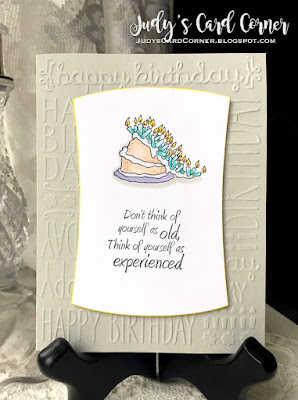
A dry embossed card base can add some fun to a CAS card design.
Kymona
design defined:
Using staples to adhere your sentiment keeps your card CAS!
Kymona
design defined:
Using staples to adhere your sentiment keeps your card CAS!
Rachel
design defined:
Adding a shadow around your image can make your coloring stand out on a plain white background.
Go have fun creating your CAS design and don't forget to link up here on the challenge blog by Monday at NOON (CDT)!


Brought a lovely smile to my face admiring the fabulous and fun inspiration....Thank you x
ReplyDeleteAnd I wonder why my sweet tooth is tingling! Fabulous inspiration from the DT!
ReplyDelete~carol
Love the cue word and the inspiration from the designers!
ReplyDelete