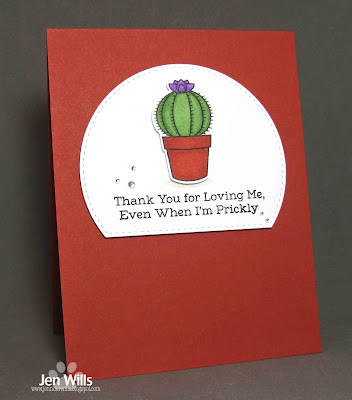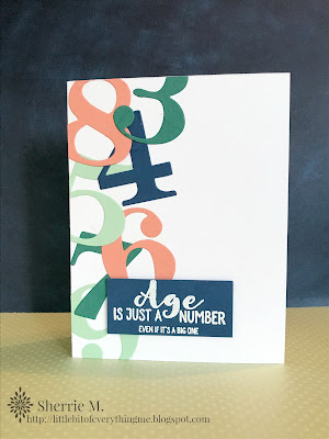
Things could get a little sharp in the gallery this week! This cue is one that will definitely bring to mind a variety of ideas! We can't wait to see what your creative brainstorming yields!
As always, remember the following CAS guidelines when creating your design:
- One main image
- Lots of open space, uncluttered
- Limited layers & embellishments
- Quick & easy to recreate (Note: It may take a while to create a design you like, but once you have that design, making more should be a piece of cake!)
STAMPlorations is returning as our wonderful sponsor and is offering this challenge's winner a $15 gift certificate to the online store! Remember, during the weeks STAMPlorations is sponsoring us, you can refresh your craft stash with the help of the 10% off discount code, CASOLOGY!
Have you heard?! STAMPlorations is having their August Christmas Release Blog Hop this week, so be sure you go hop along for wonderful inspiration and fabulous prizes!
Take a look at what the design team and this week's guest designer created for inspiration!
Guest Designer: Amy R.
design defined:
Lots of open space & limited layers keeps this design clean & simple.
design defined:
Lots of open space & limited layers keeps this design clean & simple.
design defined:
Add interest to your CAS card with pops of color.
Add interest to your CAS card with pops of color.
A shaped panel adds interest dimension to a CAS design.
Jen
design defined:
Using patterned paper in small doses keeps things CAS.
Jen
Keep your design to 1/3 of the card to preserve white space.
Go have fun creating your CAS design and don't forget to link up here on the challenge blog by Monday at NOON (CDT)!


Simply stunning creations from the DT - what great ideas for the theme! Jo x
ReplyDeletewonderful cards!
ReplyDelete