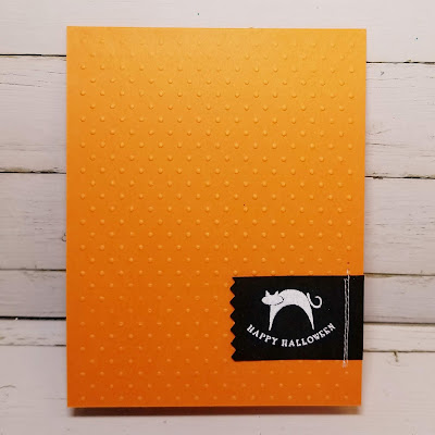
It's scary how fast October has flown and now many people are gearing up for Halloween! Tricks and treats abound! (Unless you eat all the candy beforehand.)
As always, remember the following CAS guidelines when creating your design:
- One main image
- Lots of open space, uncluttered
- Limited layers & embellishments
- Quick & easy to recreate (Note: It may take a while to create a design you like, but once you have that design, making more should be a piece of cake!)
Uniko Studio is returning as our wonderful sponsor and this week's winner will receive an in stock stamp set of his/her choice from the online store!
Let's see what the design team and guest designer created for inspiration!
You can go BIG yet keep things CAS.
Empty space need not be white.
Bright colors surrounded by lots of white space is definitely CAS.
Cluster design elements to preserve white space.
Keep your design to one side of the card.
Go have fun creating your CAS design and don't forget to link up here on the CASology blog by Monday, October 29, at 9:00 a.m. (CDT)!


Amazing cards from the DT x
ReplyDelete