It's time for a new cue word and, once again, this word can be interpreted more than one way! We're curious to see what it makes you think of!
Let's take a look at what the design team and this week's guest designer created for inspiration!
Guest Designer: Coni
design defined:
Keeping a monochromatic palette with lots of white space works to achieve a CAS design.
design defined:
Keeping a monochromatic palette with lots of white space works to achieve a CAS design.
Ardyth
design defined:
Stamping off center can add interest and reinforce your message.
Deidre
design defined:
Classic color schemes keep a card CAS.
Hannelie
design defined:
'Black' space creates a dramatic effect.
Hazel
design defined:
Sentiments can be fun backgrounds in a CAS design.
Jacquie
design defined:
An angled, embossed panel adds interest without distracting from the focal point.
Jen
design defined:
Washi tape makes for a great CAS embellishment.
Joyce
design defined:
Texture adds interest to white space.
Judy
design defined:
One main image, one layer card - definitely clean and simple!
Kymona
'Black' space creates a dramatic effect.
Hazel
design defined:
Sentiments can be fun backgrounds in a CAS design.
Jacquie
An angled, embossed panel adds interest without distracting from the focal point.
Jen
design defined:
Washi tape makes for a great CAS embellishment.
Joyce
design defined:
Texture adds interest to white space.
Judy
design defined:
One main image, one layer card - definitely clean and simple!
Kymona
design defined:
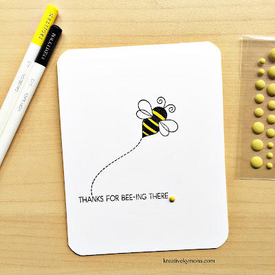
Adding a dotted line creates movement.
Melissa
design defined:
Keeping design elements together on one section of the card base preserves white space.
Sherrie
Adding a dotted line creates movement.
Melissa
design defined:
Keeping design elements together on one section of the card base preserves white space.
Sherrie
design defined:
Confining and centering the focal point in an embossed area preserves white space.
Tracey
design defined:
Placing your activity in one section of the card front maximizes white space.
Confining and centering the focal point in an embossed area preserves white space.
Tracey
design defined:
Placing your activity in one section of the card front maximizes white space.
Go have fun creating your CAS design and don't forget to link up here on the challenge blog by Monday at NOON (CDT)!


Congrats to Coni for the guest design! I love the inspiration from the DT. Each one of them is superb and FAST!
ReplyDeleteThese are awesome!! Such a fun cue card!
ReplyDelete